A few weeks ago on Facebook, I posted a desperate plea for help along with this picture, and many of you responded:
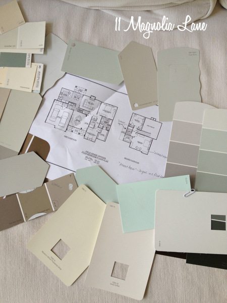
I was surrounded by about 50 of my favorite paint colors, and I couldn’t use them all.
You see, we’ve decided to live on the Army post when we move to Savannah. I tried (SO hard!) to find a gorgeous historic house for us to live in, but we just couldn’t find a home that fit our parameters for location, safety, budget, and proximity to post (where the hubs works) and the kids’ school downtown. If we were buying, it would have been much easier, but since we’re keeping our house in Nashville as an income property and the economy is still so uncertain, we wanted to rent in Savannah. We figured that since the airfield is right smack dab in the middle of Savannah, we’d get location, location, location, even I had to sacrifice my dream of a street lined with Spanish moss.
Even though I’ve been married to my husband forever, and he’s been in the Army the entire time, we have never lived in military housing. The reasons are numerous and probably boring, so I won’t go into them, but let me just say that this is a completely new experience for me. I also find it a bit difficult to imagine that I’ll be living in a house where I can’t paint my kitchen cabinets white, but I am going to take one for the team this time and concentrate on blooming where I am planted!
I can paint this house, but when we move we have to paint it all back to their standard off-white color (unless the next family wants to keep our color choices–fingers crossed!). Because I’m on the hook to paint it all back, I “limited” myself to painting just the master bedroom and bath, my son’s bedroom and bath, my daughter’s bedroom and bath, and the laundry room. Since we’ll be near the beach, I chose colors that are light enough to work as neutrals but that also pull the beach indoors. Here are the big winners:
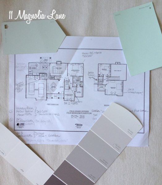
The master bedroom and bathroom are going to be Sherwin-Williams Sea Salt, as is the laundry room. It’s the chip that’s at the top left in the above photo.
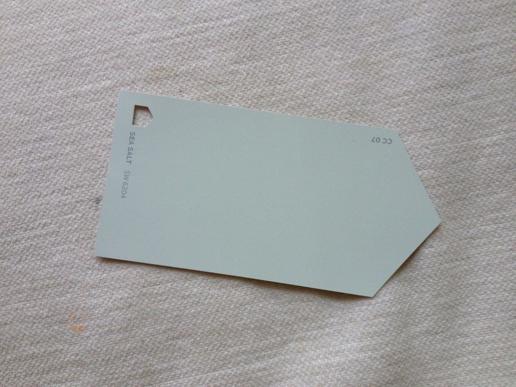
![]() Sea Salt looks gray in some light and slightly aqua/green in others, so it should work with my gray and white bedding in the master and the aqua of my Ball jars in the laundry room (if you click on the links you can see what decor is in those rooms right now).
Sea Salt looks gray in some light and slightly aqua/green in others, so it should work with my gray and white bedding in the master and the aqua of my Ball jars in the laundry room (if you click on the links you can see what decor is in those rooms right now).
By the way, I ALWAYS decorate my laundry room. I spend so much time in there that I’ve considered putting in a mini-fridge and a chaise lounge!
My son’s room and his bathroom will be Grayish by Sherwin-Williams. I know it’s hard to tell what a color will look like from a computer picture, but this is a light and true gray. It should go well with his red, white, and blue decor. Since his bathroom is also the powder room (we have two bedrooms down and two up), the paint should also be a good background for the white shower curtain I have planned. I’m going to copy Amy’s powder room in her old house that you can see {here}.
I contemplated using Sherwin-Williams Fawn Brindle, which is in our current living and dining rooms, but thought I should go a few shades lighter since there’s only one window in his bedroom.
Source
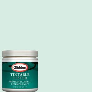
My daughter’s bedroom and the upstairs bathroom, which she’ll share with guests, will be Glidden’s Almost Aqua. I have to say that all the computer images of this paint color look way too green–it’s more blue on the chip. At least, I hope so!
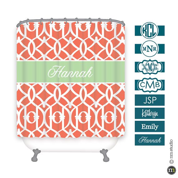
I ordered this cute shower curtain from CLINGeverything, a seller on Etsy, with a coral background and an aqua monogram (the picture is of a seafoam green monogram). I think that will pop in the upstairs bath.
Source
I hope it won’t be too many days before I’ll start to have a few rooms organized and decorated, and I’ll start showing them to you one by one. For all of you who gave me paint suggestions on our Facebook page, thank you so very much!
Thanks for stopping by!